 and
and  and
and 
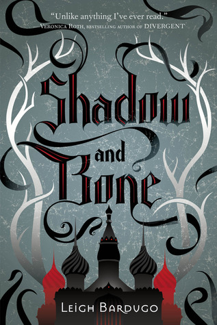
At first glance, there's nothing really similar about these covers. But when I look back at the ones I really got excited over, I noticed that most of them have dark colors and suggest dark themes. I don't know what it is, but I love the hints of darkness and danger that these novels just seem to send out in waves. They make me want to pick up the book and find out the story behind it. I mean, don't you just want to go into that castle? Walk through that red mist? Find out why that girl in the beautiful dress looks so sad sitting next to that bird cage? I sure as heck do.
On the other hand, though, sometimes I'll see a cover that just looks 'meh' at first, but after I actually read it, it takes on a whole new meaning and becomes almost personal because only you and anyone else who's read it can understand its significance to the story - it's like you know a secret. For example:

Now, even if you hate the Twilight Saga (I don't), you can deny that the covers of the books are intriguing. What the heck is an apple, a flower, a ribbon, and chess pieces doing on vampire stories? Well. I know! It's all about the symbolism, people. Even though, um, the flower basically means nothing. Everything else, yes, but the flower on New Moon? Yeah. It's just there to look pretty. Moving on.
I can appreciate really simple cover art. Even if it doesn't necessarily make the book pop, again, if you've read it, it takes on a whole other meaning. Like:
 and
and  .
.I have to admit, I actually adore the Speechless cover.
The last thing I want to talk about is cover re-designs. Yeah, I understand that they happen. And publishers don't care that we want our books to match. *cries* Sometimes, they're alright, but other times...not so much. Example of a good one:
 to
to 
Though the eye thing has been done before for sure, it's better than the original, which features a pretty girl in a beautiful dress, which really makes no sense when paired with the story. Plus, I love the little details in the eyelashes of the redesign - there's birds and stuff if you look really closely.
Now, one that I don't like so much:
 and
and  to ... ....
No. Just no. LOOK at those first two covers. They are absolutely magical. The last one is boring and has no personality. Just another sci-fi book I wouldn't look twice at because I'm usually not a huge fan of that genre. When I first saw it, I was like:
But, alas, there is nothing I can do but stare mournfully at the unmatched series that will never truly feel complete. *sigh*
Anyway, my point is: it's impossible to not judge a book by it's cover. People just naturally like pretty things that draw them in, and everyone is different. Some people will love a cover, and some will hate it, just like the content of the book itself.
Those are just my random musings on covers. What makes a cover beautiful to you?
No comments:
Post a Comment